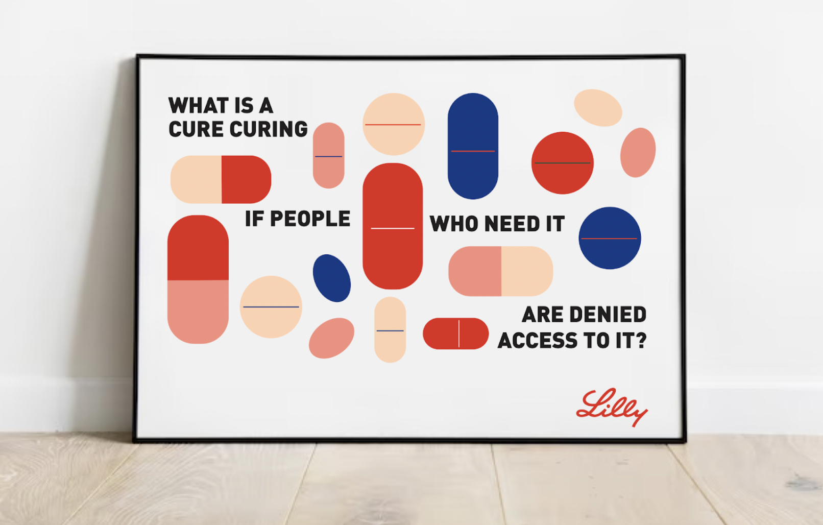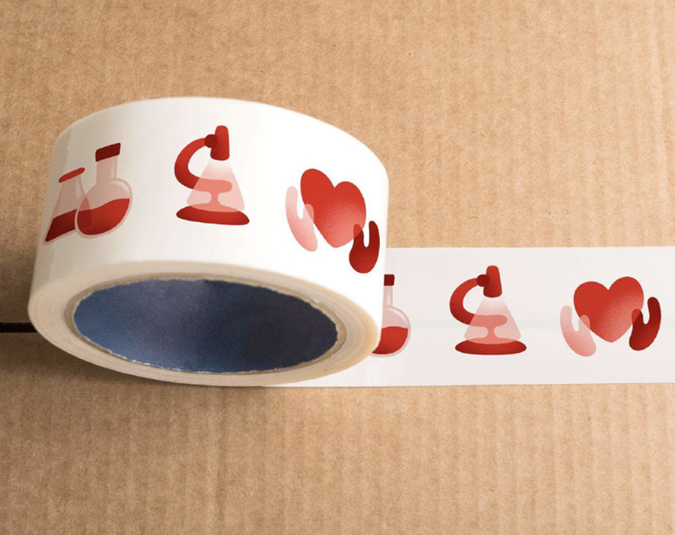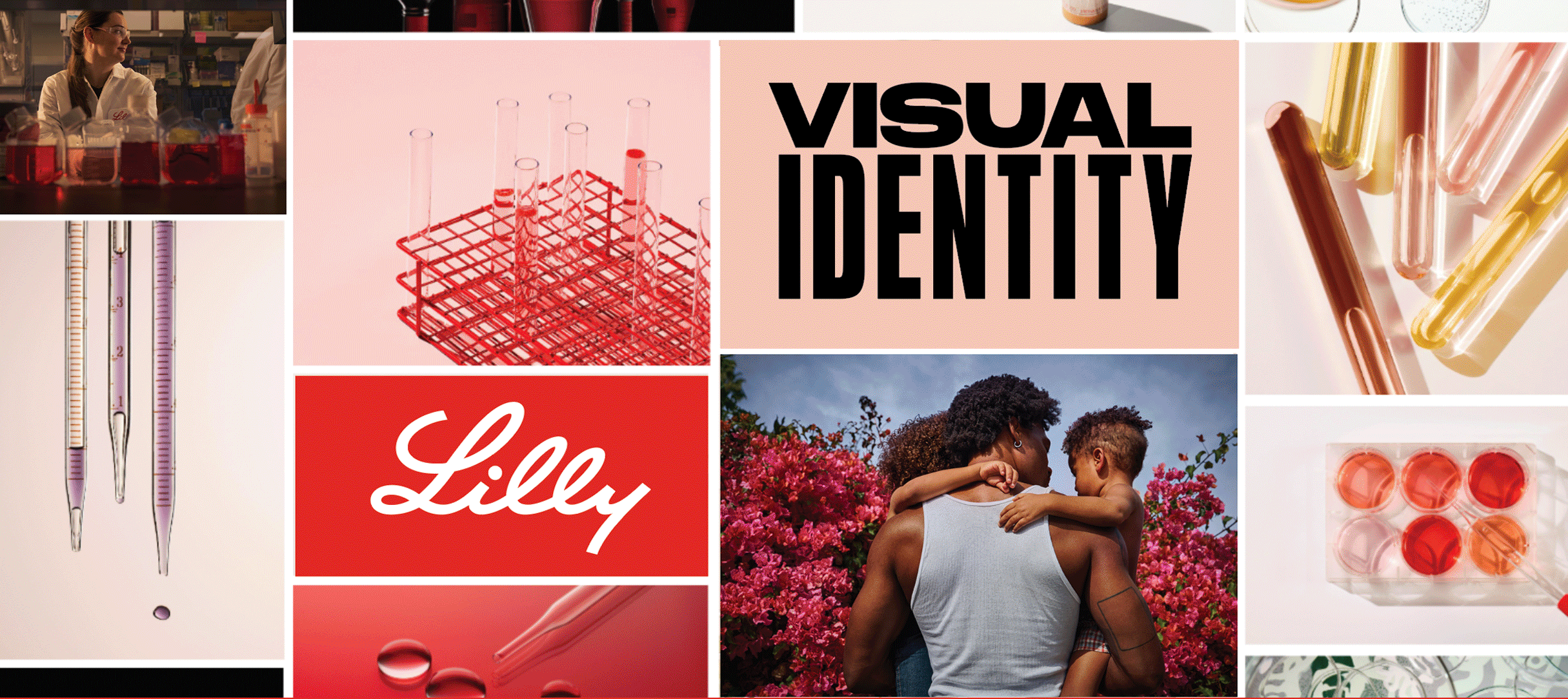
Brand System & Visual Identity Design
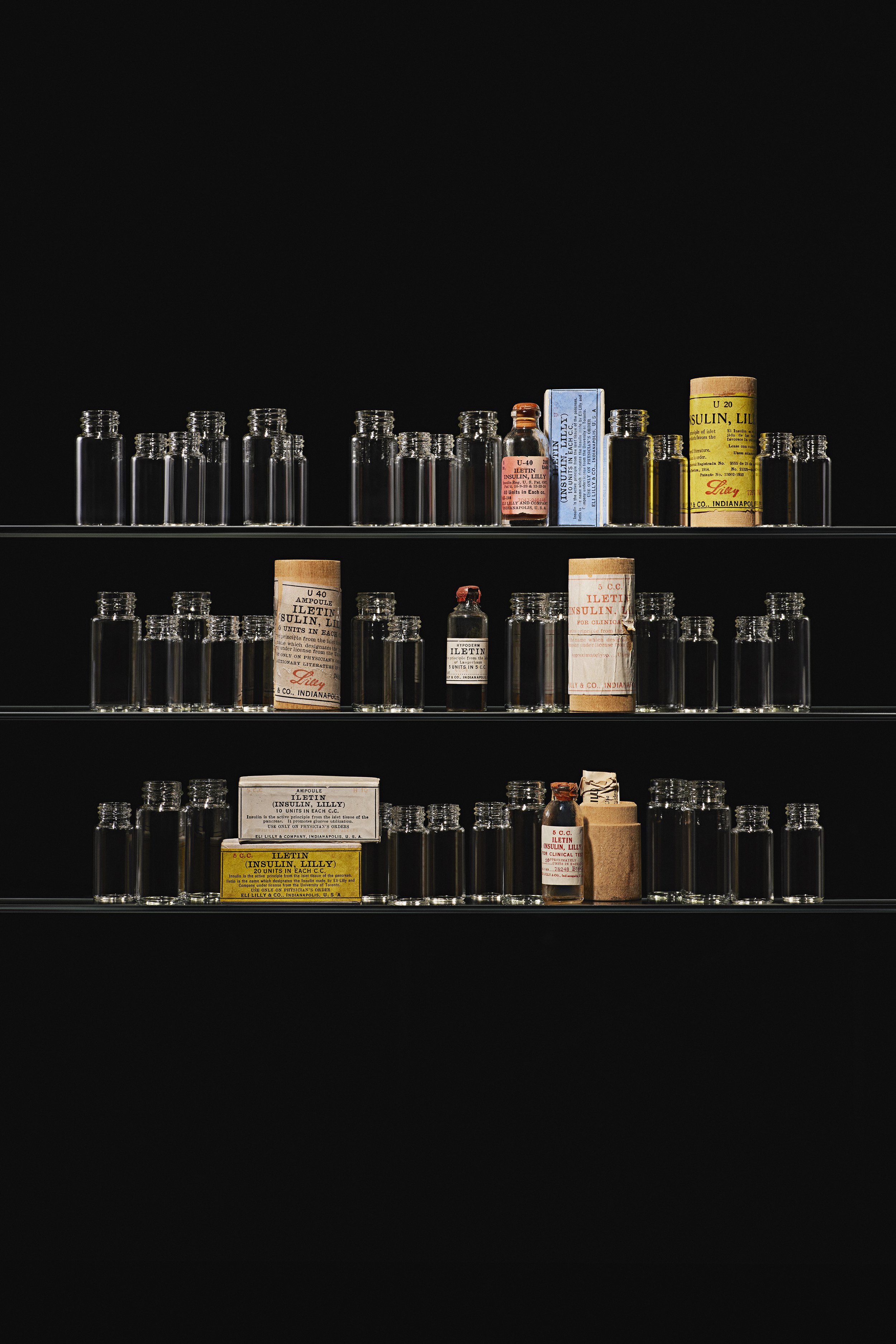
Eli Lilly & Company came to the design team at W+K to develop a brand platform and visual identity system that could streamline across their global company. They were in need of a master brand system that could flex seamlessly across campaigns, internal initiatives, medicines, platforms, applications and environments. In the end W+K handed Lilly a 400 page brand book that encompassed a vast brand architecture, to an updated logo that included a custom drawn monogram that could extend the brand to a wider variety of applications, a new color system, custom patterns, photography library, icons and more.
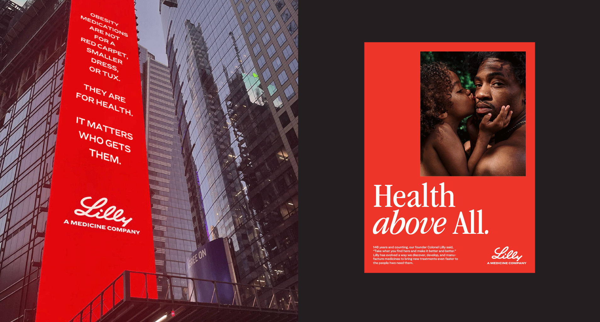
The work with Lilly is to breakthrough the traditional Pharma category and be patient first with tenets that express warmth, authenticity, empathy and curiousity. The updated visual identity design has transformed Lilly externally through the eyes of t consumers as well as internally as a company. It has give Lilly the foundation to to extend Lilly’s brand message to the world.
Creative Director: Pierre Jouffray
Design Directors: Christin Spagnoli, David Trujillo
Art Director Photography: Christin Spagnoli
Color System: Christin Spagnoli
Senior Designer: Brooks Heintzelman
Designer: Reena Chai
Illustrators: Jim Ward, Dave Hagen, Reshidev Rk

Art Direction
Art direction for Lilly’s brand photography included three areas of focus: People, Tools of the Trade and R&D. For People and R&D we wanted to show patients and scientists at their most authentic, with emotional connection, curiousity and expertise.
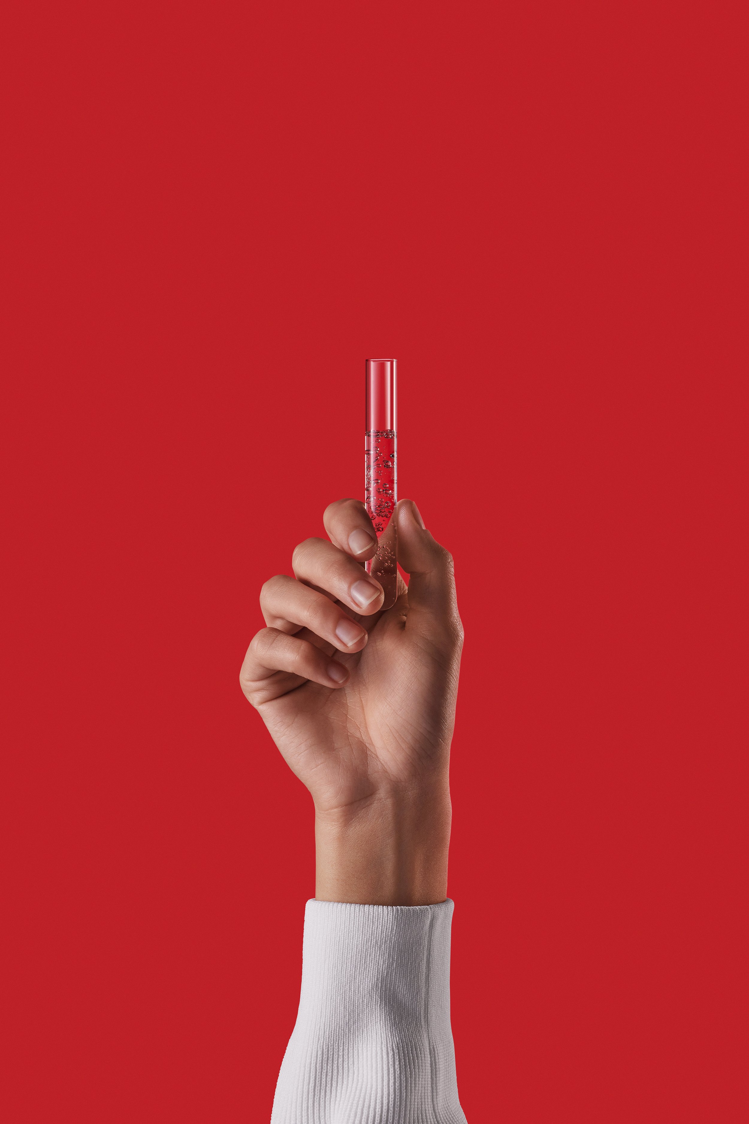
For Tools, we wanted to push agaist the sterile focus of the industry. Being inspired by beauty and make-up photography, we decided to shoot Tools to show the beauty in the process and set Lilly’s photography apart from the category.


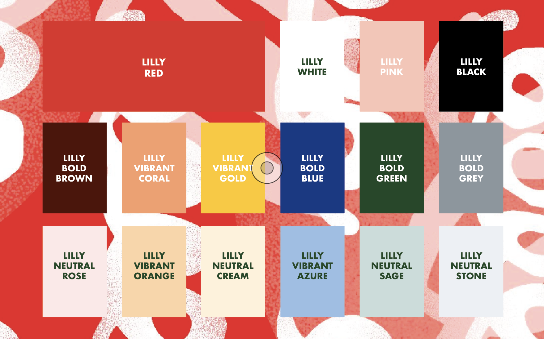
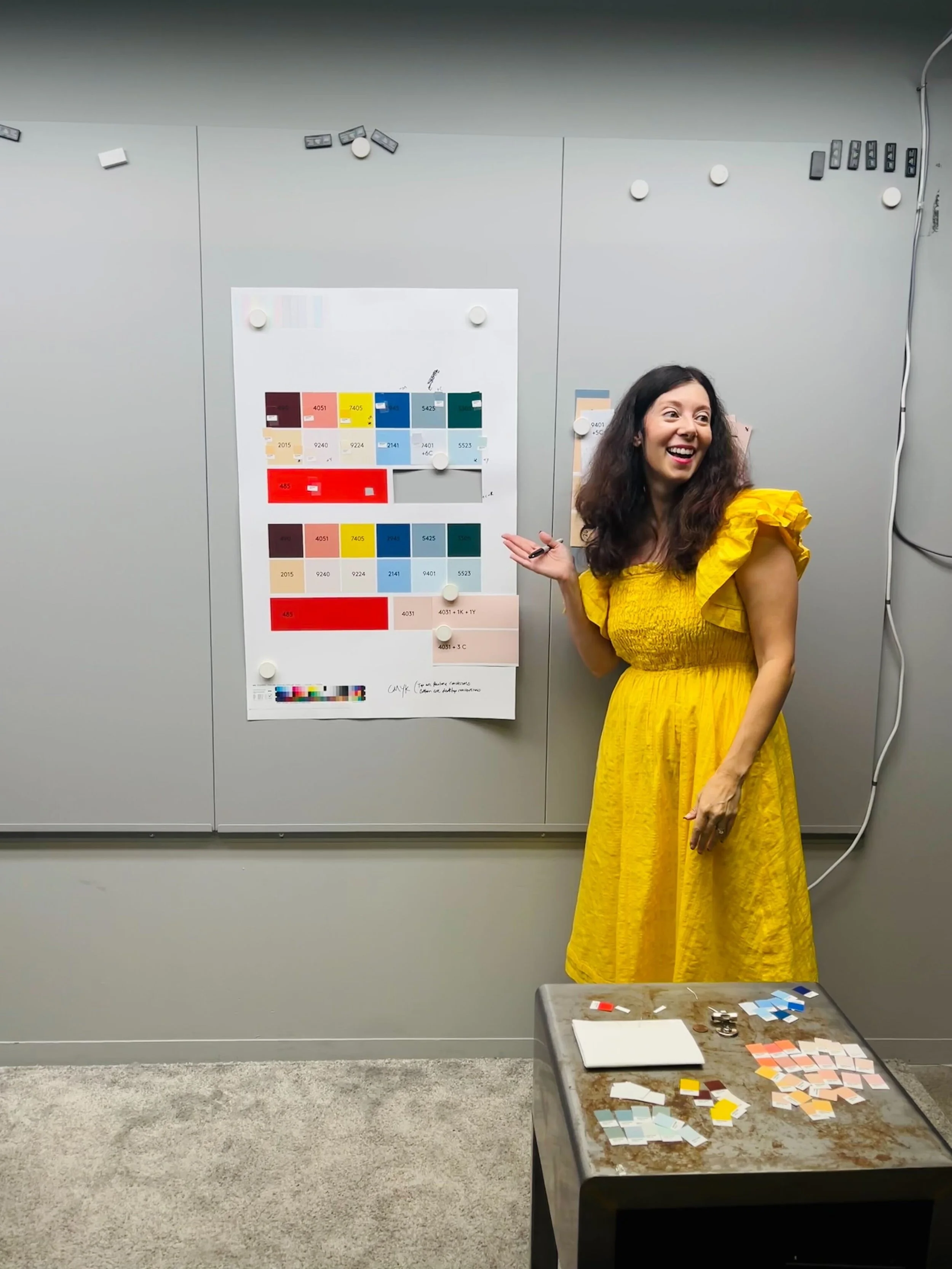
Color
We wanted to achieve 4 things with a new palette for Lilly. 1. Bring warmth to Lilly’s predominately red and black palette by adding a neutral pink to the core system. 2. Create a secondary palette that included tonal pairings for ease of use and flexibility across Lilly’s vast internal programs. 3. Create an ADA accessible palette. 4. Hero Lilly Red across the system while bringing a distinct way of using Red to set it apart from the category.
Because Lilly’s vast network of over 12,000 employees will at some point interact or create a program involving the color palette, we creates a system of warm and cool colors that include a mix of Bold, Vibrant and Neutral colors that could work across many mediums- with one rule in mind- that Lilly Red must always be at the forefront of the palette.