From our very first meeting with Eli Lilly, it was clear they were a brand that encompassed boldness, truth, humanity and stood for something. One of the first presentations we had with Lilly included these tenets brought to life with rich photography juxtaposed with an expanded. brand color palette and typography that drew a line in the sand. The presentation design let to the foundation of the design and creative that would become their first Olympic campaign. A year later, Lilly would come to us to create their design and VisID for their global company based off of this system.
The WHO ranks the U.S. 37th out of its members when it comes to a country’s overall health and health system. But have you seen the U.S. in the Olympics? We have the highest medal counts in the world. We dominate. So what does a company that believes in putting health above all say during the first Olympics ever cancelled due to health?
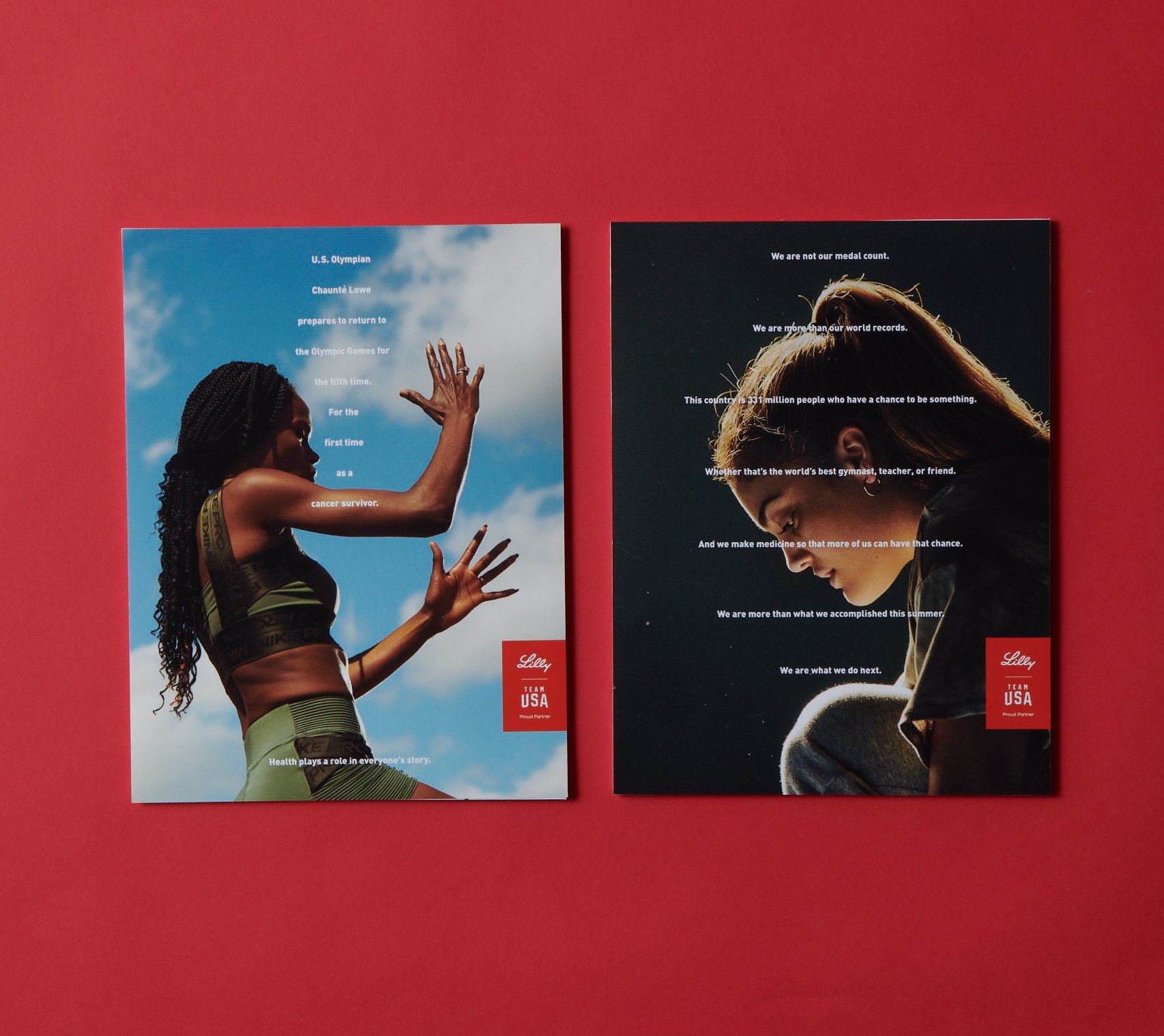
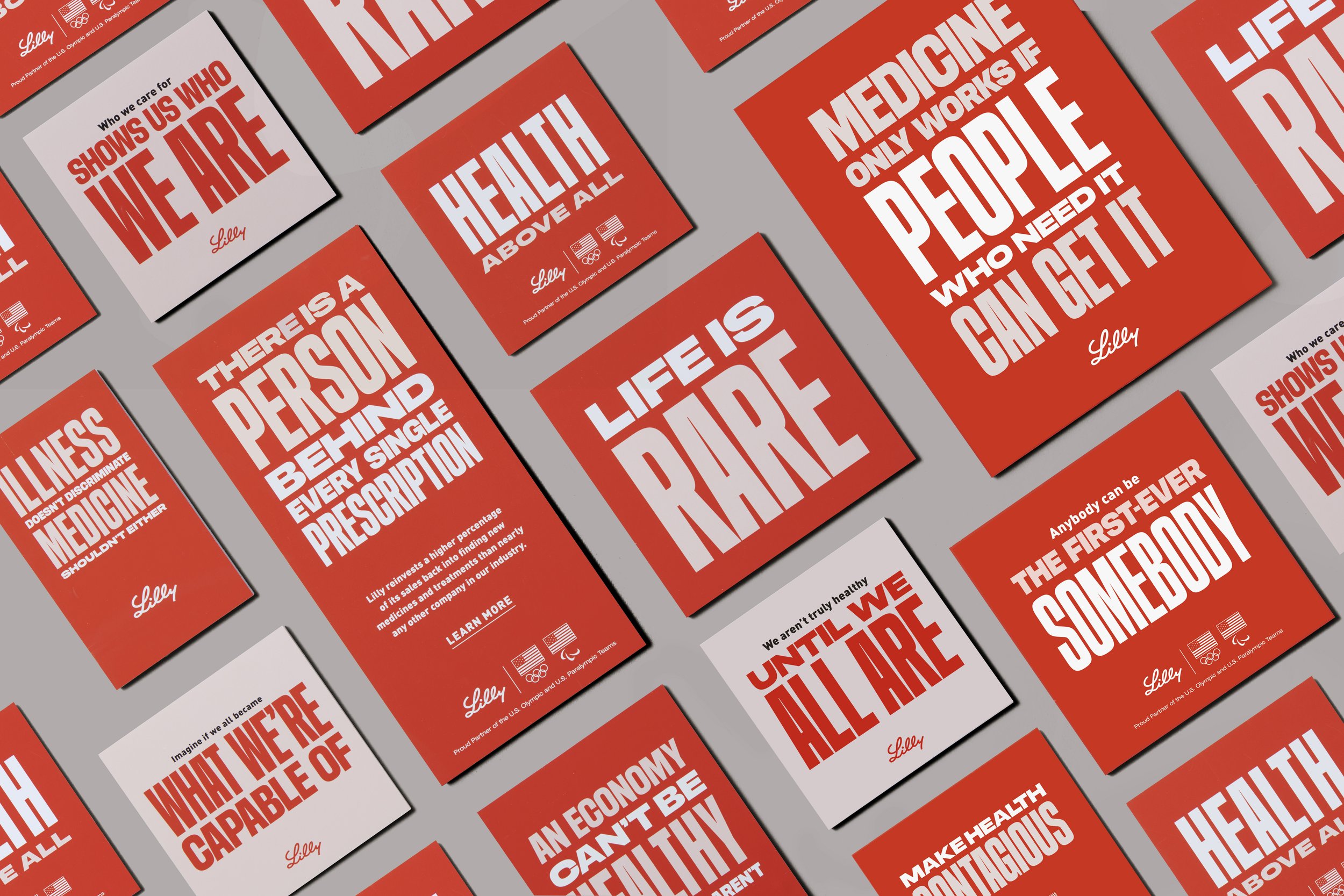
Design system included bespoke headlines using Media Sans to highlight poignant statements about health juxtaposed with stunning photography of life and Lilly athletes.